Senate Portraits
My set up. (click on pictures for a larger view)
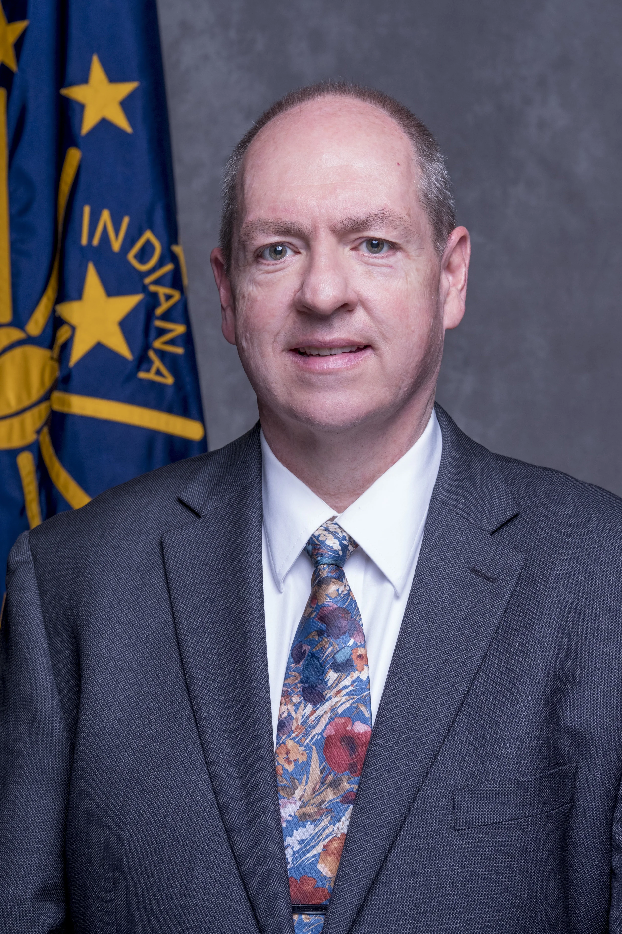
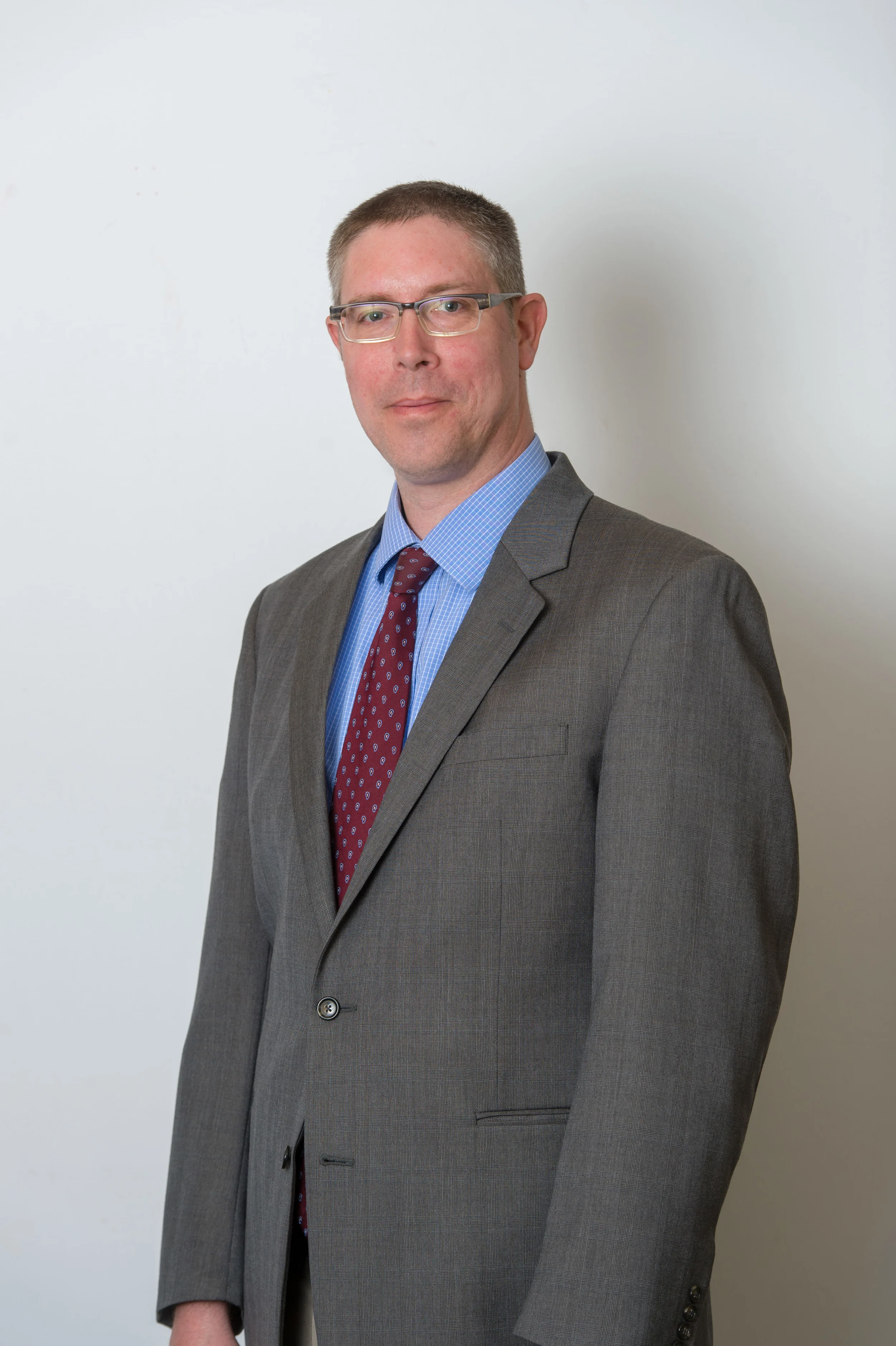
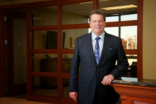
For the portrait session part of the day I was set up in the hallway outside the chambers so we could have easy access to the senators as they roamed the halls to and from meetings. I used a clamshell set up with a light on a boom, a reflector under for fill and a background light to brighten the background. The lights I used were Flashpoint 360ws Streaklights with Bowens adapters. The background light used a gridded hair light from LA softbox to avoid light spill. I used the Fujifilm XT2 with the 50-140mm at f/8. This camera and lens combo is the sharpest I've ever shot with, its truly an amazing combo although I am falling in love with the 16mm f/1.4 macro.
Senate Chamber Group Panorama
This is my 3rd panorama and 2nd portrait session with the Indiana senate. The senate is all about business so making sure I was doing things quickly and efficiently is very important. I was able to get into the senate chamber 20 minutes before the scheduled group photo so I was able to get a plan worked out. There were several obstacles to overcome the biggest being where to take the photo. The further back I go the more of the front desk is in view (which means more photoshopping) but I get a better picture with less distortion. I tethered my Fujifilm XT2 camera to my laptop so I could get a better idea of what the final composite would look like and decided the further back I go the better.
The closer view with less desk but more distortion. Doable with lots of photoshopping but not ideal.
I opted instead for this view. So we took down the monitors and stuff of the desks and went with this view. Less distortion but still lots of work to take out the desks.
The second obstacle was that the room was rather large but even my widest lens, the Fujifilm 10-24mm f/4 wouldn't be wide enough. Having done this is year past with a Nikon D4 and D800 with the 14-24mm f/2.8 I knew what I was up against. I ended up using the 16mm f/1.4 at f/4 and focused somewhere in the middle of the room to get the best depth of field. This ended up being a fantastic choice as everyone was in focus and sharp as a tack. The room is also very dark and in years past I've hand held the D4 at high ISO and a faster shutter speed just to speed things up. This year I opted instead to use a tripod so I could get a lower ISO and slower shutter speed. This also turned out to be a great decision as the final image is noise free with great color and very good dynamic range.
The final image: Fujifilm XT2, 16mm at f/4, ISO 400, 1/4 Sec.
Notice I'm getting use out of the flip screen, something I once thought was a gimmick but now use more than I expected.
The image I used to replace parts of the front desk.
I ended up having to put the legs of the tripod up on the desk with the back leg on the ladder to get the height needed to get the look I needed to get the people in the back in the picture.
I also took some pictures of the carpet knowing that I would have to replace the desk with carpet and stars as well as part of the front row or senators desks.
All in all it was a better experience than the last 2 times I've done it. Partly because of experience but also because of the sharpness of Fuji's lenses and the ease in which I'm able to get around the XT2 and the great color coming out of the camera. All in all the Fuji system has proven itself to me once again.


